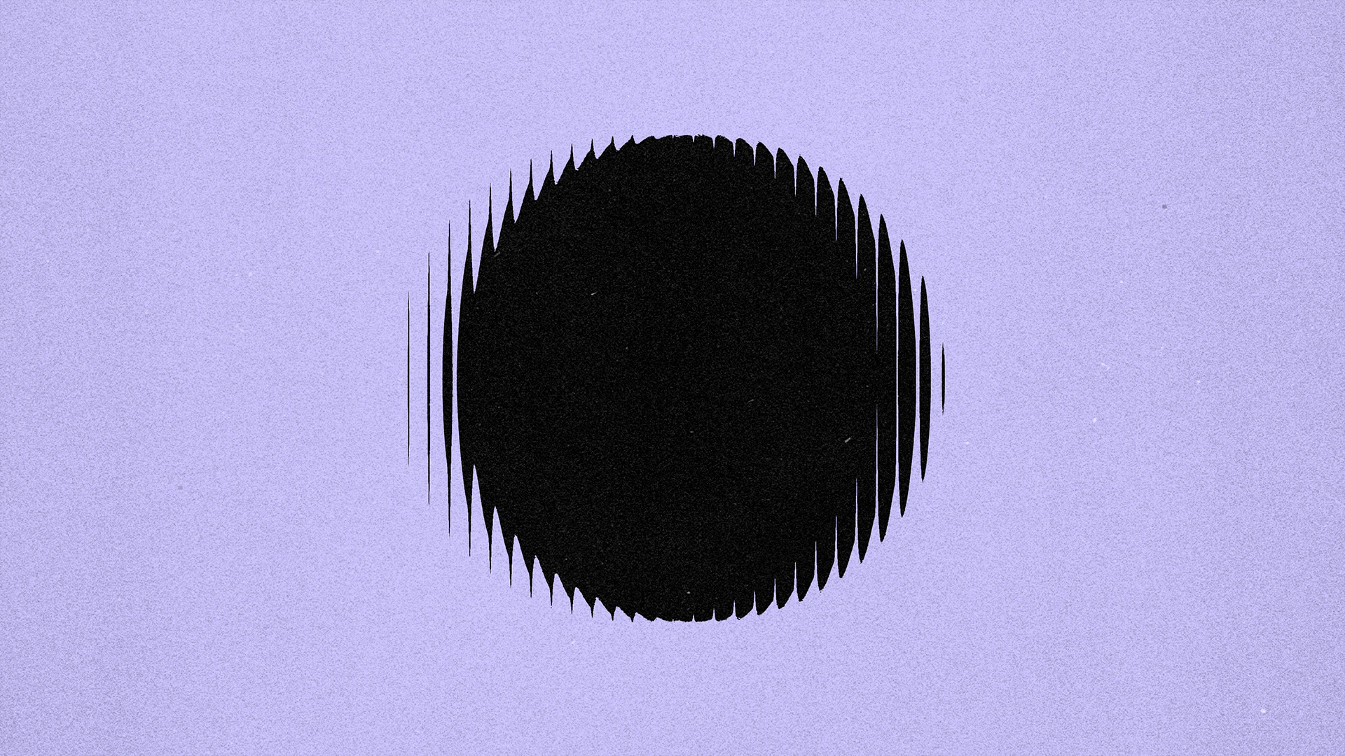
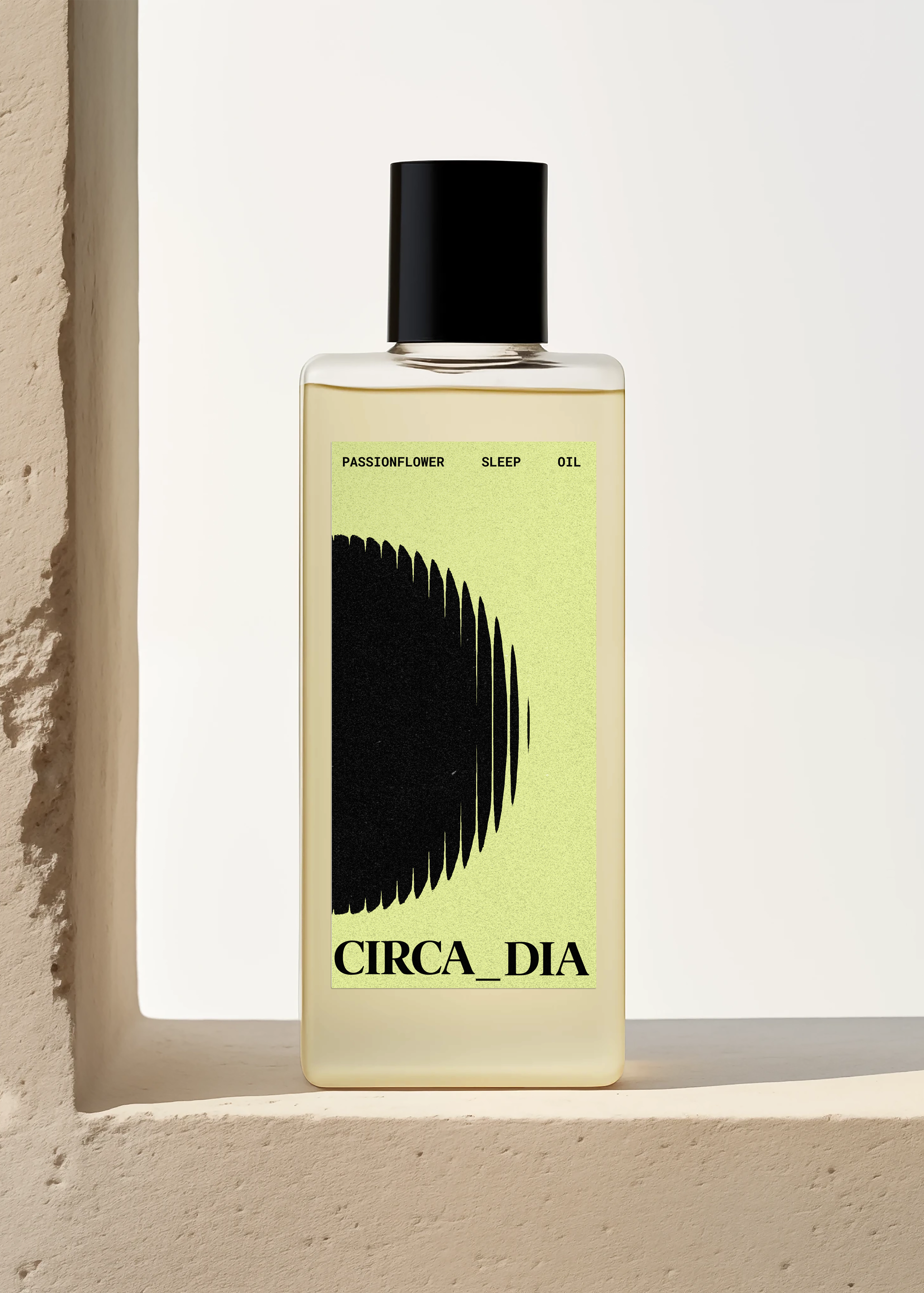
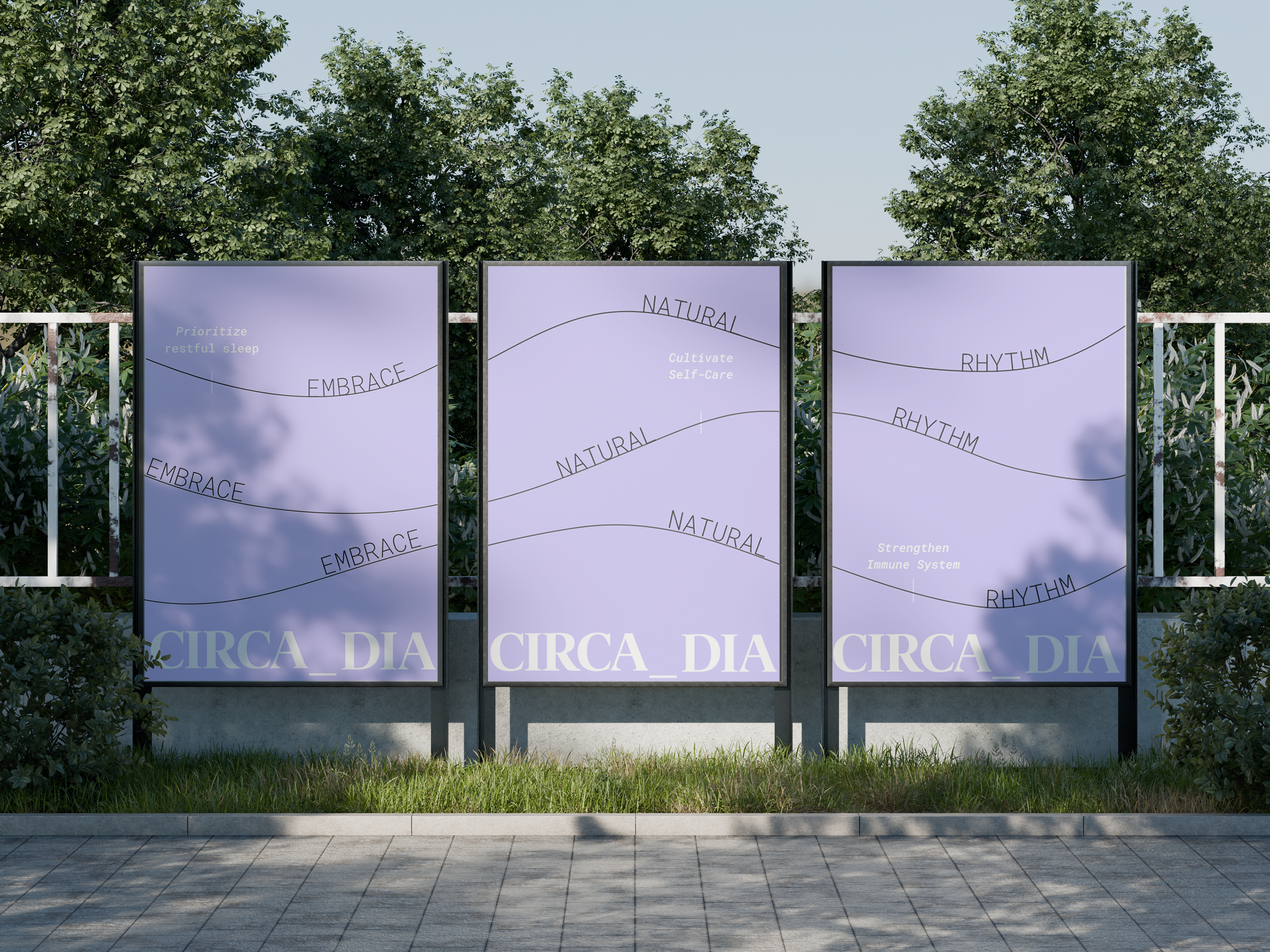
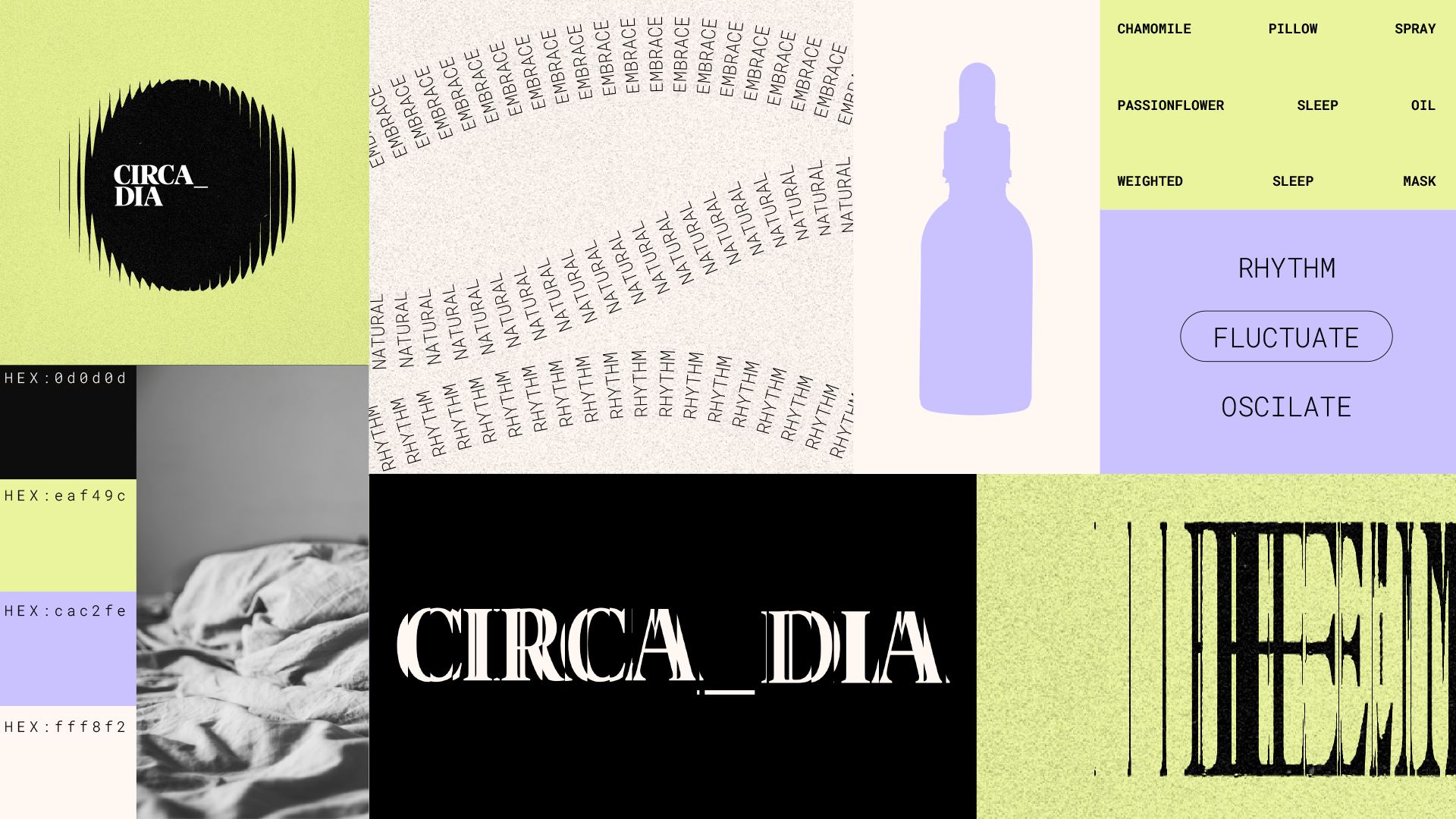
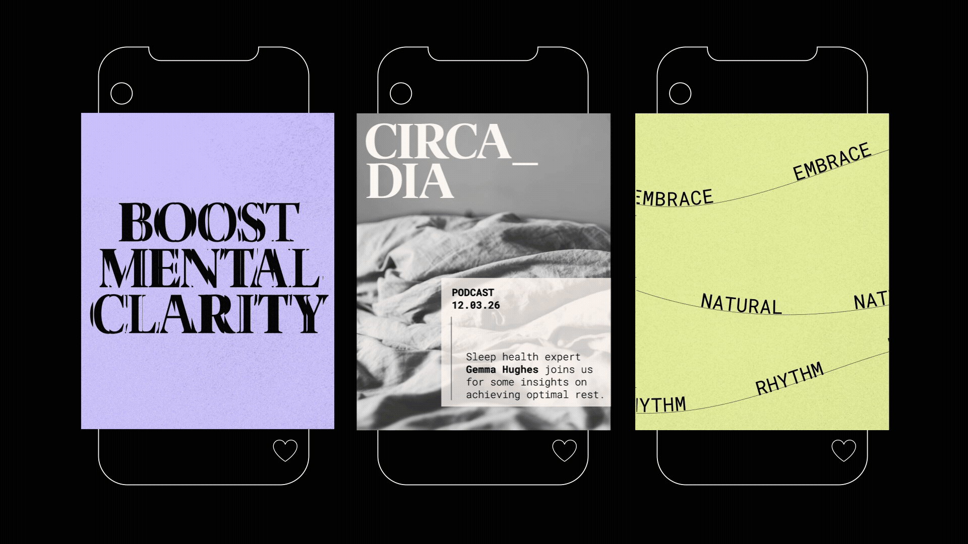
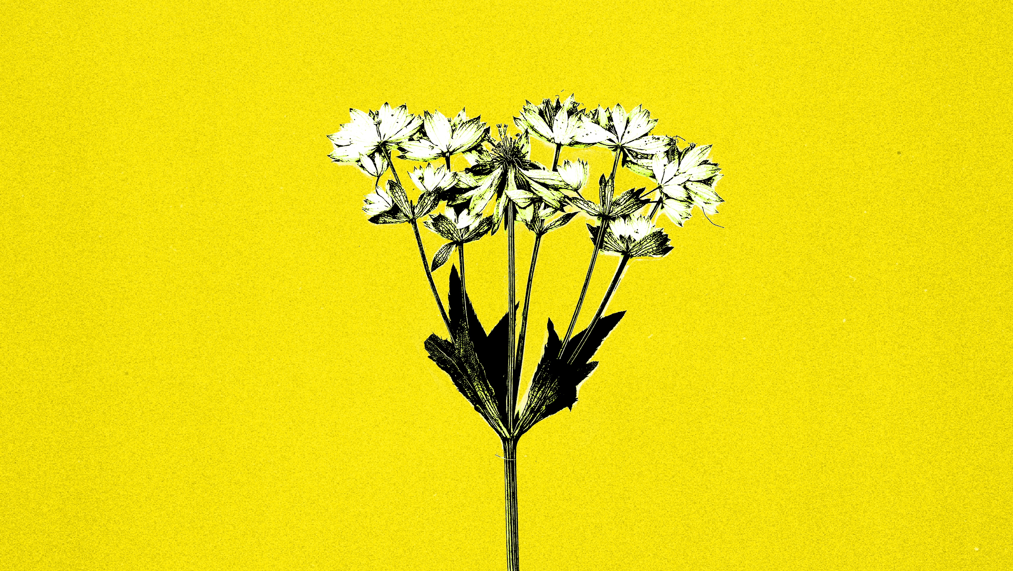
This project explores a visual identity for a sleep wellness brand rooted in the science of circadian rhythms. Inspired by the natural oscillation of our internal clocks, the identity uses flowing, wave-like lines to evoke rest, balance, and continuity. Type and forms are softly refracted, creating gentle rhythms that feel organic and closely connected to nature. The system extends across social media, packaging, and web, using a calming pastel palette. Warm, subtly noisy textures enhance the sense of comfort and rest.